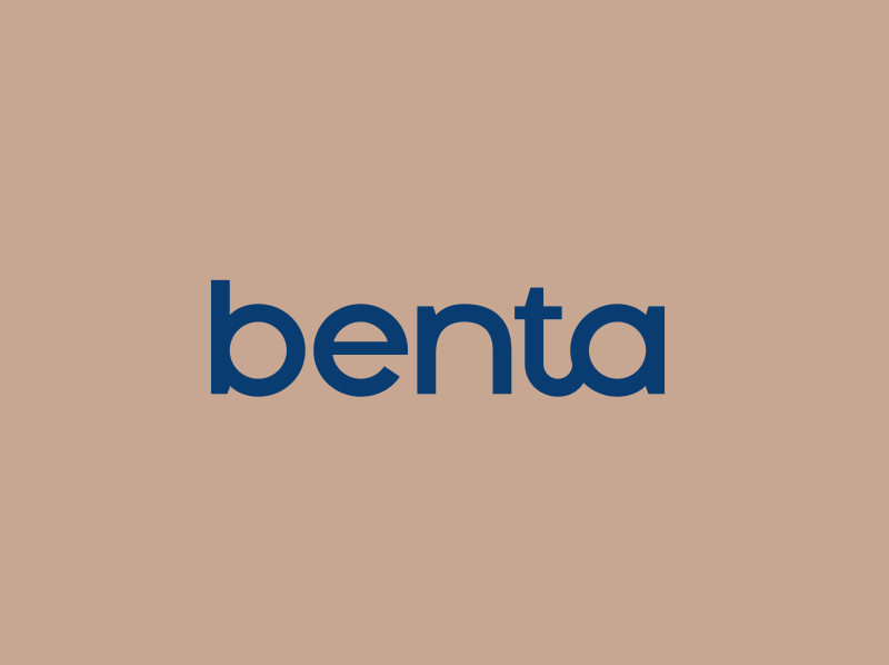
Benta
The sea is Portugal and Spain’s territory. The sea, which provoked so many fears and temptations, is present in Benta’s brand, and served as an inspiration to compose a mythical and typical universe. The Benta logotype has a sober and sans serif typographical drawing, practically modernist. The bond between “t” and “a” assigns a classic […]
Read more "Benta"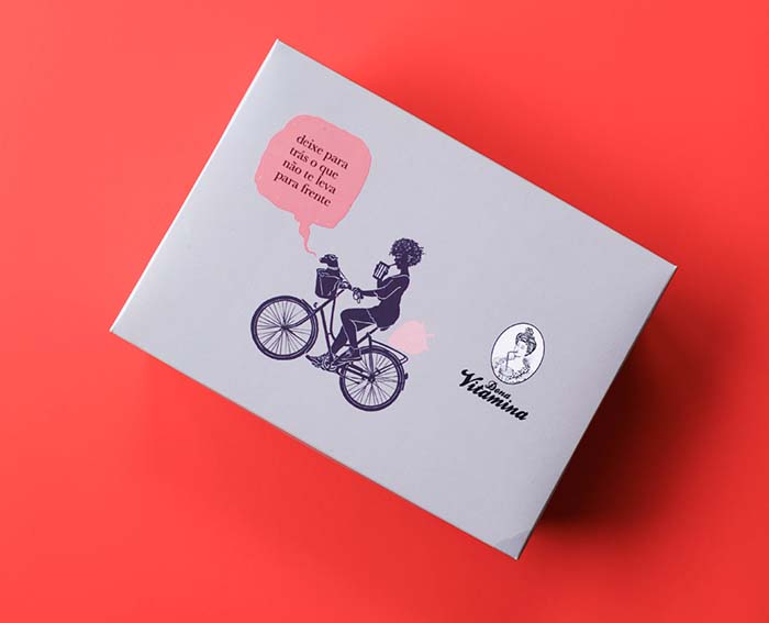
DONA VITAMINA
After ten years, Dona Vitamina was living a need to change its branding language, preserving its original essence of humor and reinforcing the genesis of female empowerment present since the begin. Laika created a series of narratives with women, other Donas Vitaminas, which contemplate other ethnicities and feminine manners. However, always maintaining the disruptive essence […]
Read more "DONA VITAMINA"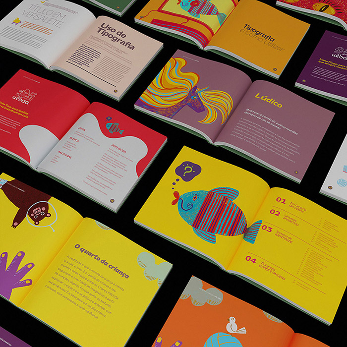
UÊBAA
The Uêbaa brand needed to find its own branding language, which would develop narratives for its final audience, children and their parents, building an affective connection with them. The tone of the brand’s speech was rethought and a series of ludic narratives, illustrations and pictograms were created to bring Uêbaa closer to its audience. Applied […]
Read more "UÊBAA"
U!mano
The bar project developed to the Ibis hotel chain immerses itself in the culture of São Paulo city in its essence: the way of appropriating every culture that arrives in the city, because nothing is strange, everything is digested by the city of São Paulo. The project should have the soul of São Paulo and […]
Read more "U!mano"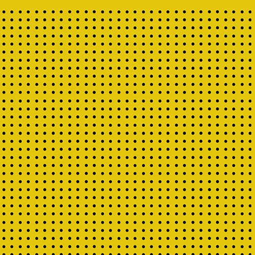
DORINA NOWILL
The graphic emulation of the Braille writing system was the starting point for the Dorina Nowill Foundation for the Blind’s 2018 annual report graphic project. In the visual aspect, compositions with dots, which constitute Braille, configuring linguistic utterances, are distributed throughout the publication; and, in its tactile aspect, the dry relief feature on the print […]
Read more "DORINA NOWILL"
BÁRIO
Inspired by the pinball culture – rescuing that feeling of slapping the machine so the ball doesn’t fall into the endless hole –, Bário was born: a bar with arcade, bringing to Brazil the complete experience of meeting friends with beers and incredible drinks, irresistible food and everything washed down with rock n’ roll and… […]
Read more "BÁRIO"
TIME FOR FUN
Time For Fun hired Laika to build their new brand. Among the challenges, we needed to contemplate two statements that could be used alone or together. The result you see here!
Read more "TIME FOR FUN"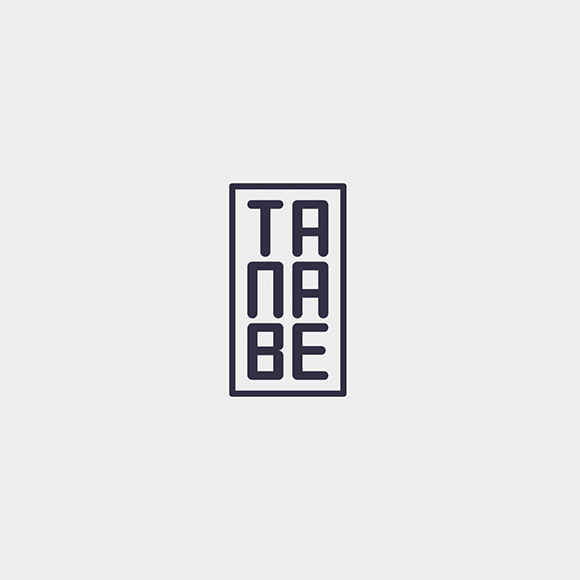
TANABE
Tanabe’s logotype has a graphic structure inspired by inkan, a signature record through what, in the West, we call a stamp. The inkan acts as an authentic signature and has legal value. Inspired by the art of Japanese calligraphy, shodo, Laika released the paw and let the brush create expressive and dynamic shapes for the […]
Read more "TANABE"
MOM
Our challenge was to design and translate into brand design (name, verbalization of brand culture and design) the essence that our client wanted to print in the daily life. MOM was born with a manifesto, proposing a rupture in the relationship with dogs and cats to return to the animal nature. Yes, MOM – dogs […]
Read more "MOM"CHEZ VOUS
Belgium is here Chez Vous is a Belgian restaurant in São Paulo. An authentic Belgian Restaurant! Despite being the country’s only representative in the Brazilian city, its identity project did not reflect the Belgian humour and its cultural unfolding. Rain, French fries, Magritte The Belgian iconography is extensive, from plastic arts to tennis. It is […]
Read more "CHEZ VOUS"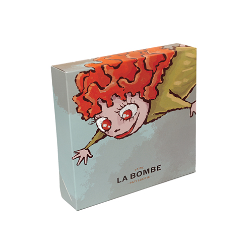
LA BOMBE
La Bombe produces delicious eclairs from a family recipe. And with it, their stories. These stories have been translated by Laika into playful and surreal imagery, with characters that inspire lightness and an explosion of joy. The idea is that La Bombe invites you to be part of a dream.
Read more "LA BOMBE"
SUPERLIMÃO
Superlimão is a Brazilian architecture office located in Sao Paulo. In a multidisciplinary and plural way, it creates architectural projects based on relevant premises of contemporary architecture, such as respect for the environment, economical and durable productive solutions and furniture. To represent the discursive aspects of the brand, Laika designed the new logo inspired by […]
Read more "SUPERLIMÃO"
RECLINERS
Recliners is a brand specialized in reclining furniture. It produces sofas and armchairs with a classic trend design, with simple and discreet lines, and is inserted in the history of Brazilian furniture.By rethinking the brand and its purpose, Laika sought to reaffirm the culture of the Recliners brand, inspired by the purpose of creating timeless […]
Read more "RECLINERS"
RIBA
RIBA can be the utmost in the remarkable landscape of Rio de Janeiro. Is it a restaurant? A sophisticated bar? RIBA may be Ribamar, the owner of the bar; or what comes from above; or a rib sandwich in Uncle Sam’s mouth. It is a unique way of existing and happening, with unique style. We […]
Read more "RIBA"
LENDME
LendMe is a fintech specialized in home equity and financial technology services, meeting consumers and companies.The brand icon is the representation of the binary information, structured in a pixel-like composition. The brand identity is based on two secondary colors, which are combined with the main color according to the context of the message and its […]
Read more "LENDME"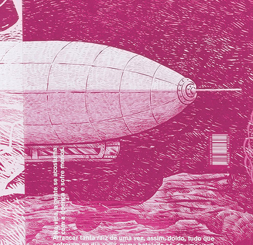
JUSTINE
Justine is a graphic novel. The reader is invited to unfold the book and discover its intricacies details. Thus in the first book cover happens the unfolding of the leaf in fragments that, little by little, form an big image of aesthetic and narrative impact. Principal cover is all black, syntetic, the antithesis of consumerism […]
Read more "JUSTINE"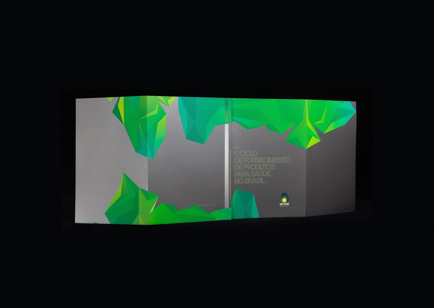
ABRAIDI
Abraidi, Associação Brasileira de Importadores e Distribuidores de Produtos para Saúde, ordered from Websetorial an extensive study on economic activity in the health area, presenting perspectives and proposals for the sector, summarized in a white paper. Laika developed graphic design – language, image editing and infographics – and coordinated the production. The result is a publication […]
Read more "ABRAIDI"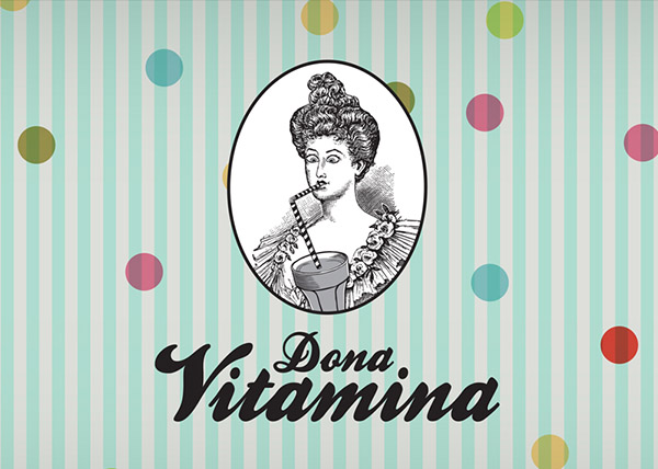
DONA VITAMINA
Healthy food: from a rather vague experience of food, which would descend to the common place of natural, Laika conceived the name and brand Dona Vitamina. And the brand is a good-natured Victorian lady coming out of her composure while drinking with a straw a delicious vitamin. Healthy eating yes, but with relaxation and humor. […]
Read more "DONA VITAMINA"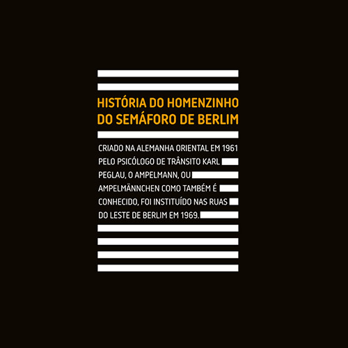
STREET BURGER
For the design of the new Street Burger restaurant, among many experiences, we brought the signage of the toilets directly from the streets of eastern Berlin, the ampelmann, that little man with a hat at the Gothic traffic lights. Also, the walls stuffed comic strips ensure congestion in the use of the restrooms! It’s to […]
Read more "STREET BURGER"
BRASPAG
Laika designed the Braspag brand. However, we live in a frantic, liquid and changing world. So, Laika redesigned the Braspag new brand in 2018 (until the speed of change separates them!). Enjoy some fragments of the Braspag identity that express the frantic transformation of the Braspag brand in the e-commerce segment since 2012!
Read more "BRASPAG"
UMM
Architect Elaine Gonzalez hired Laika to build the brand for her new architecture office. Based on that, we created the name UMM. What is the concept? UMM is unique. It is not repeated. Created for you, with your way of living, the way you see things, day by day.
Read more "UMM"
KT
The Kawahara and Takano brand represents the synthesis of a cultural atemporality, West and East meeting contemporaneously. Just like Japan in the past Japan today: the same graphical principles in a postmodern rereading. The calligraphy leaves the paper and gains neon structures. The colors come from the past times, in dresses or canvas, and invade […]
Read more "KT"
CONTAIN [IT]
They make everything cool to fit inside containers! And they often extrapolate. We design the brand to fit [the concept] and more.
Read more "CONTAIN [IT]"
SOFÁ CAFÉ
SOFÁ CAFÉ was conceived as a dream place, where the presence of the sofa invites you to spread out and enjoy the time passing with the palate surprised by the taste of special coffees. The architectural design of the office Super Limão spatially materialized the surreal nature of the images we created. We built the […]
Read more "SOFÁ CAFÉ"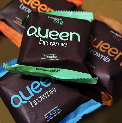
QUEEN BROWNIE
After a thorough work on the nature of the brownie (yes! that chocolate cake, which hides many secrets, one of them is the fabulous recipe seized by a chef in his youth, as a student of gastronomy in Beatles’ land), we arrived at the name Queen and all the universe of the brand image. Queen […]
Read more "QUEEN BROWNIE"
Restaurant DUI
The dui restaurant is in history as one of the Laika brand projects. Chef Bel Coelho’s restaurant has left in our memories a permanent aroma of sophisticated dining experience in its simplicity. Taste a little of what is left in our memory.
Read more "Restaurant DUI"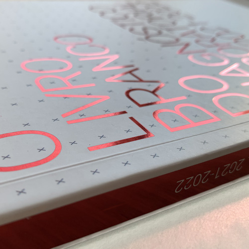
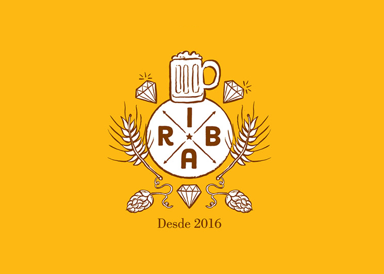
RIBA BEERS
A light beer for the heavy days! Or an always light beer for any day. Anyway, beer label Light, very light RIBA, in the clouds! to continue the family of RIBA beers.
Read more "RIBA BEERS"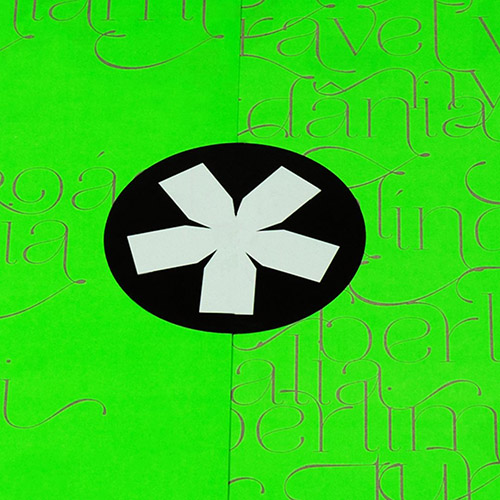
RIBA Mural
Laika created the name and the brand Riba. Thereafter Laika passed by and scribbled one of the 7-meter walls with sequential graffiti.
Read more "RIBA Mural"
Dorina Nowill
Laika was invited to create illustrations for the 2019 Calendar of the Dorina Nowill Foundation for the Blind. The challenge was to explore the dialogue between photos of the blind with the language of illustration, recreating scenarios and presenting the context of their daily challenges overcome with the help of the Foundation.
Read more "Dorina Nowill"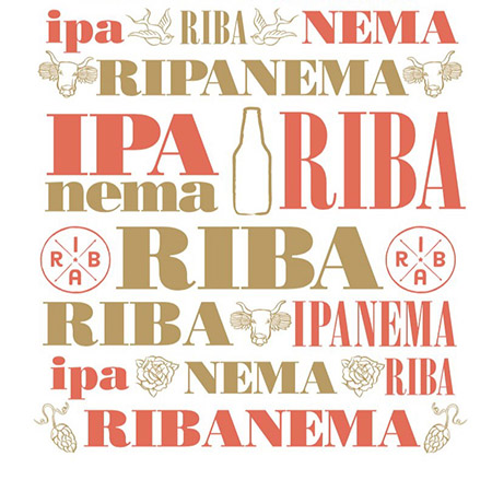
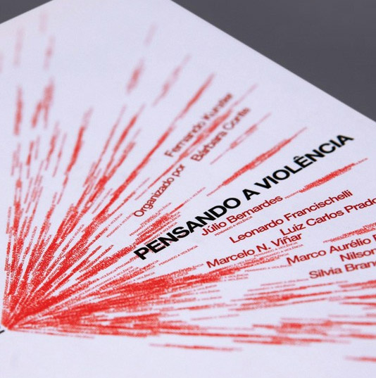
Book Covers
Pensando a violência Vários autores Perversão em cena Eliane Kogut A formação do psicólogo: Clínica, social e mercado João Leite Ferreira Neto Prostituição: O eterno feminino Eliana dos Reis Calligaris
Read more "Book Covers"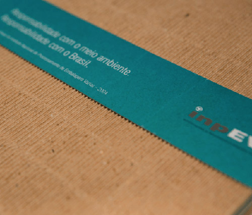
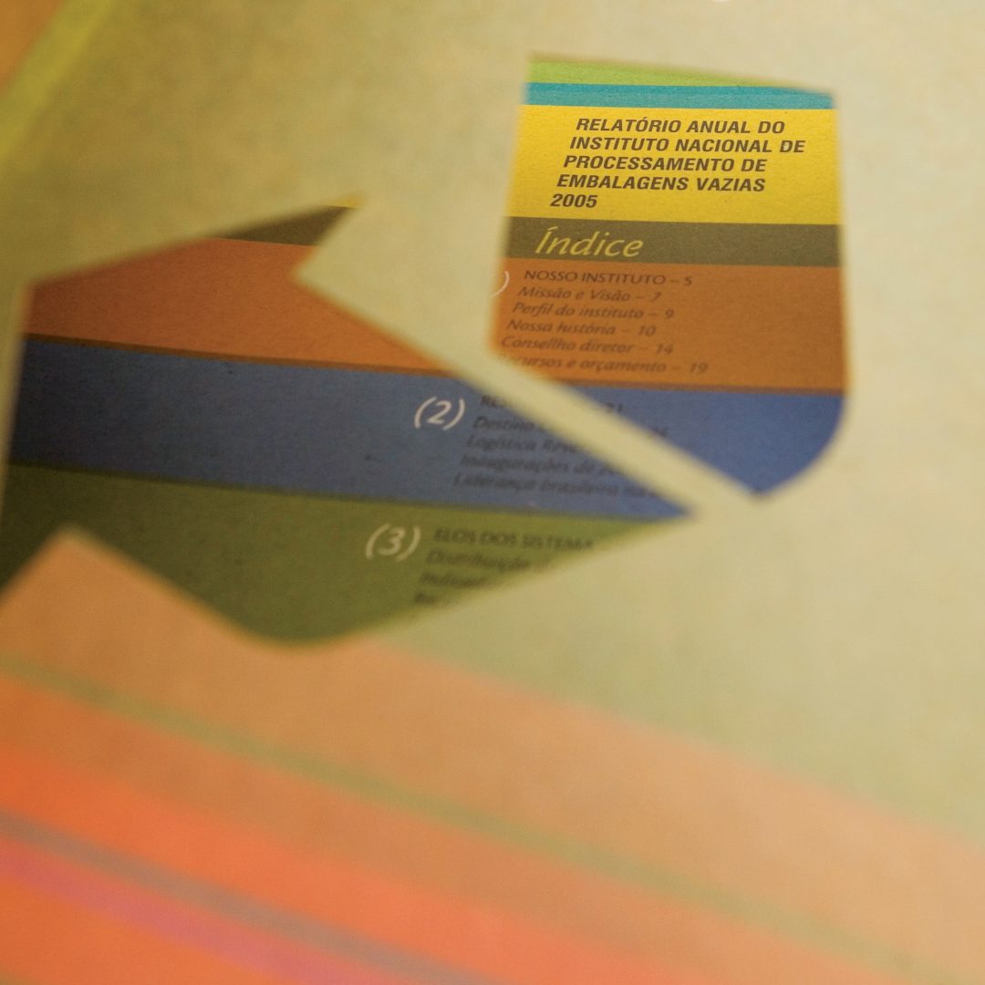
INPEV
Graphic project of annual report of 2004 for inpEV, Instituto Nacional de Processamento de Embalagens Vazias. In the project execution, we used micro corrugated paper exploring the texture of the waves of the brown raw paper. The graphic effect is the tactile feel in handling and relevance to the theme of innovation and sustainability that […]
Read more "INPEV"
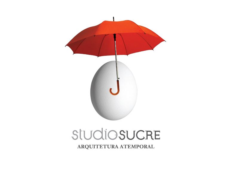
SUCRE
SUCRE makes architecture with projects that extrapolate the common. In 2006, Laika remade the brand Sucre by juxtaposing two elements: the egg, the original architectural, comparing it to the uterus, symbolizing the perfect house, without edges; and the umbrella, icon that is present in the cultural imaginary as the thing that protects, but also allows […]
Read more "SUCRE"
ZAMBON.INC
We designed a brand for Zambon.Inc and there is the result.
Read more "ZAMBON.INC"